

Nudging gets people to do what you want
Everyday nudging can make the desired direction easier to choose. I discuss a mountain bike trail, choices in sales and our experience with smaller lunch plates in 2014.
The video is from May 2014. On a morning walk, I share three examples of how layout and design can influence the way people use a trail, choose a service or serve themselves at a buffet.
Everyday nudging makes the desired direction easier
I was out digging mountain bike trails with a mountain bike club. On a trail like that, it is best if everyone rides the same way through the forest.
You could put up big signs or have someone telling people which way to ride. But you can also design the trail so riding the desired way simply works best.
For example, a crossing over a tree trunk can be arranged to be awkward from the opposite side. Then the trail itself pushes people in the right direction.
That is the idea in nudging I find interesting: Arrange the surroundings to help people do what you want them to.
The options influence what customers choose
You can work with the same thing in an online shop or when selling a service.
If you have three options, there is often one you particularly want to sell. You can highlight it with text such as "Best value" or "Most popular".
The other options also shape the choice. If one seems too cheap and another too expensive, the third can appear the obvious choice.
It is an example of how presenting options can push a customer in a particular direction.
If you want to read more about my approach to selling online, you can find the book e-pusher.
We changed the plates instead of ordering more food
When Agera, Dinero and Amino shared offices, we had a lunch problem. In principle, we ordered enough for everyone, yet food often ran short.
The obvious solution was ordering more. But I had heard smaller plates could make people take less from a buffet.
So we went to IKEA and bought small plates instead of large ones.
My experience was that the problem disappeared after that change. People could still take another serving, but not everyone bothered going up twice.
We did not make a rule allowing only one serving. We changed something in the surroundings that affected how much people took initially.
Look at the layout before writing another notice
That is the thinking I want you to consider next time you want to change behaviour.
Can you arrange things to work best when people use them the way you want?
I think that is a friendlier approach than another rule or bossy notice. Choosing differently is still possible, but doing what works best becomes easier or more obvious.
For me, the mountain bike trail and small plates are good examples of a design change doing the work without constantly having to correct people.
See how my friend Rasmus got people to slow down outside their house:
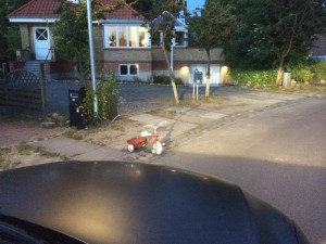
- A little red bicycle nudged people into slowing down
Kan allerede se E-pusher udvide med endnu et fantastisk afsnit 🙂